The Proposed Process
Step 1: Identify the need
Step 2: Design
Step 3: Back-end development
Step 4: Front-end configuration (or really development at this point)
What’s most important (always) is Step 1 and Step 2; but this post will focus on Step 3 and Step 4 since I feel when doing these steps, the documentation is all there in places like experience.sap.com and sapui5, but is still pretty cryptic for beginners. That said, this is guide to help you see a real example, and not really training material. Actually, it’s more just a dump of information but if you are persistent and give this a go yourself, it should at least help with knowing you’ve got all the bits to put it together.
Step 1 – Identify the Need
This is not a technology looking for a problem; but a technology that can address real User Experience issues and opportunities for some groups of people. I think the most obvious one is a People Manager Overview Page with a Smart Tile that highlights the need to look at it. E.g. Upcoming important dates like birthdays or contract end dates; Leave Calendar, Team Timesheet status. These are all Smart Business Tiles at my current Customer, but Home Page Tiles are valuable real estate (like your smart phone’s screen), so let’s not force our functionality all to the home page.
Step 2 – Design
Build.me has a fairly rudimentary version of the Overview Page; hence we ended up just using drawn pictures in a freestyle build project; and in reality, an Excel spreadsheet was the final mockup/documentation for each Card. Hopefully build.me improves with the ability to shape the output over time; but at least producing this for end users; helps drive the discussion early to avoid rework after the build.
Step 2.5 – Design -> Build transition
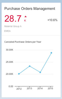
Consider this Card design:
Here we have a few things to consider:
- A Heading
- A KPI Value with a Unit of Measure
- A Comparison KPI Value (for percentage increase/decrease)
- Some grouping information (Material Group A and EMEA)
- A graph title
- An x-axis dimension (year in this case)
- A y-axis measure (number of cancelled purchase orders in this case)
- A range of data (e.g. 4 data points, 1 for each year)
- Potentially the semantic navigation when you click on the header, or select a specific dimension (in this case, “year”).
- Potentially the global filter that should be applied at the Overview Page level (note – For multiple cards; the technical name of the fields to filter by needs to be consistent across cards).
Except for Titles and semantic navigation, this pretty much defines the type of data we need to expose via oData to the Card and helps drive the discussion of what needs to be developed.
If done right, the data that gets exposed can be used well beyond just the overview page card; and will make the Front-End configuration trivial.
Note – I will point out, I’m still confused by some design choices for the Card definitions (e.g. Trend calculations in the 1.40 UI5 version compared to 1.38) so your mileage may vary depending on your desired requirements.
Real World Example…
In order to write this post, I’ve taken the following semi-real requirement for an analytical Card.
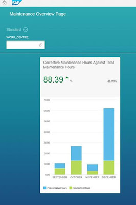
What we want to see is an Analytical Card which highlights the % calculation for Preventative Maintenance versus Total Maintenance. We also want to filter it by Work Centre. E.g. It should look something like this.
Based on above, a quick summary of the information provided is:
Title: Preventative Maintenance hours versus Total Maintenance hours
x axis: month
y axis: Percentage
y axis unit: %
KPI Header Value: This month’s percentage
KPI Comparison Value: Last month’s percentage
Show: Last 4 months
Filter: By Work Centre
Order: By month ascending
Navigation: To intent “MaintenanceHours-Analysis” (for example)
… in a Trial World
Now I don’t like writing a tutorial that you can’t go try yourselves, so I’ve leveraged an MDC HANA instance on an HCP Trial account to create the XSOData service which will expose the right Calculation View for the above to be possible. This will let you test it inside the UI5 WebIDE, but don’t expect to be able to deploy this scenario as is.
FYI – The one thing required to run this is create a destination in the HCP Cockpit like follows then your destination can be referenced in the UI5 webide and can call XSOData services exposed from the MDC HANA instance:
Step 3 – Backend Development (in HANA)
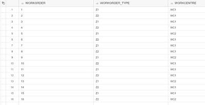
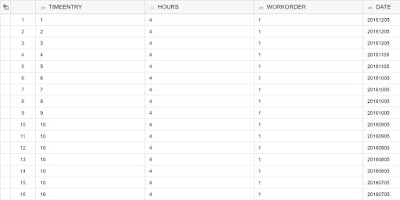
For simplicity, I’ve created the following dummy tables and data representing the ERP data (create your own tables and data which is easy to do and worth learning if you don’t know how):
- Work Orders (simplified version of AUFK but artificially including Work Centre to simplify the data model)
- Time Entries (simplified version of CATSPM)
e.g.
Work Orders (where Z1 is preventative, and Z2 is corrective):
Time Entries:
So in essence, we need a Calculation View in HANA which provides a month by month breakdown totalling all Z1’s hours and all Z2’s hours. We also need to calculate the percentage for each month; and be able to provide the current month’s percentage (KPI) and last month’s percentage (comparison KPI).
I’m not a HANA Calculation View modelling expert and you’re going to need to know some HANA modelling to get through this bit. For those who are experts, I’d love some feedback and I encourage you to blog about some complex calculation view problems you’ve solved.
So here’s the high level solution, with some screen shots.
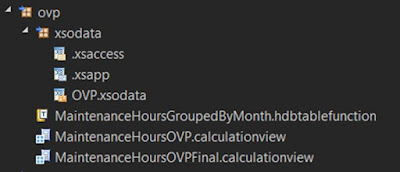
The HANA solution consisted of the following files:
e.g.
- MaintenanceHoursOVP Calculation View which provides us a month by month view of preventative maintenance and corrective maintenance.
- MaintenanceHoursGroupedByMonth table function which was created to group the previous calculation view by month consistently (the why will be explained below)
- MaintenanceHoursOVPFinal Calculation View which is the final aggregation on top of the previous Table Function which also calculated the percentage, and “this month”’s percentage and “last month”’s percentage for the KPI value.
- xsodata definition pointing at MaintenanceHoursOVPFinal Calculation View providing our odata endpoint
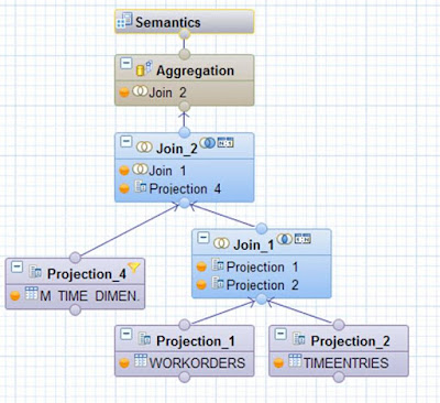
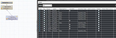
MaintenanceHoursOVP Calculation View looks like this:
Projection_1 is pretty much just a vanilla projection of the dummy Work Orders table.
Projection_2 is pretty much just a vanilla projection of the dummy Time Entries table but using some string manipulation; we’ve created 2 calculated columns (Year and Month).
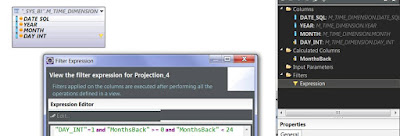
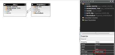
Projection_4 is using the standard M_TIME_DIMENSION table in HANA (I’ve previously generated time information using the Eclipse wizard to do this).
I’m working with Month values so I’ve filtered by the 1st of each month; plus looking at only the last 24 months of data. Note – To do a relative date, I’ve created a calculated column called MonthsBack (this is quite useful in a future calculation you’ll see shortly).
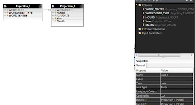
The join between Work order and Time Entry is a simple 1.n relationship from Work Order to Time Entry:
The join between Calendar and the above join uses the month/year and while in reality, there will always typically be a work order for every month; we need to mark it as a right outer join (which could occur if you ran this on a new month before any work time had been registered).
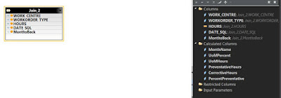
Now for the final Aggregation takes the output of Join_2, uses hours as one of the measure and creates a number of calculated columns:
- MonthName – Made from the DATE_SQL by using the useful function “monthname”
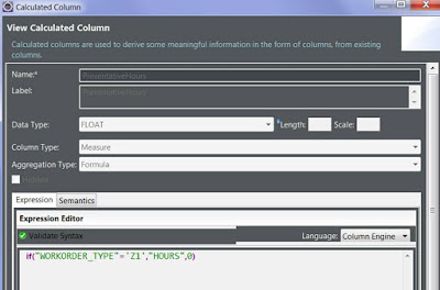
- PreventativeHours and CorrectiveHours (requires use of the IF statement tocalculated totals based upon work order type – in reality, it will be a few IF statements chained together)
- Percent Preventative (calculated using the other 2 calculated values)
- Ignore the UoM Calculated columns for the moment as that will be discussed shortly
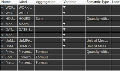
Finally, adjust the semantics on each measure (semantic definitions aren’t actually required at this point):
Now this Calculation View would actually be quite useful for anlaysis but for now, this is just the source for our table function. Now why do I need a table function? To be honest, it’s to get around anomalies with my understanding about how the above aggregation responds based upon what you select.
e.g. The Overview Page makes a few requests. One of these is the request for the graph data; and another is for the KPI values. The funny thing if I added a calculated column called “This Month percentage” and “Last Month percentage”; and I select only these 2 columns from the calculation view, HANA optimises the request in a way that produces unusual results for me (e.g. Not grouping by month). To get around this, we create a Table Function with a group by clause hopefully forcing the outcome we want.
FUNCTION "HANA_USER"."ovp::MaintenanceHoursGroupedByMonth" ( )
RETURNS TABLE ( "MonthName" VARCHAR(20), "MonthsBack" INT, "WORK_CENTRE" VARCHAR(10),
"PreventativeHours" FLOAT, "CorrectiveHours" FLOAT, "PercentPreventative" FLOAT )
LANGUAGE SQLSCRIPT
SQL SECURITY INVOKER AS
BEGIN
return SELECT
"MonthName",
"MonthsBack",
"WORK_CENTRE",
sum("PreventativeHours") AS "PreventativeHours",
sum("CorrectiveHours") AS "CorrectiveHours",
sum("PercentPreventative") AS "PercentPreventative"
FROM "_SYS_BIC"."ovp/MaintenanceHoursOVP"
GROUP BY
"DATE_SQL", "MonthsBack", "MonthName", "WORK_CENTRE"
order by "DATE_SQL";
END;
With this, we can now make a dedicated Calculation View to expose to the Card. The bonus of a using a dedicated calculation view is we can do some prefiltering to return just the 4 values we want to display on the graph:
MaintenanceHoursOVPFinal.calculationview
Project_1 looks like this (simply the Table Function as the data source, and 2 calculated fields:
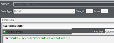
This Month Percentage looks like this:
and “=1” instead of “=0” for Last Month’s calculated column.
I also added the filter “MonthsBack” < 4 to just return 4 results.
E.g. The use of MonthsBack makes the above calculations pretty easy!
Unit of Measures are actually shown in Cards based upon semantic definitions. In HANA you can tag a measure with the semantic tag “Quantity with Unit of Measure”. It supports a constant value but it appears that the Overview Page only supports a Unit of Measure that is linked to another column, so this now explains why I’ve added PercentUoM columns.
Finally we set the dimensions/measures appropriately and we are ready to create the XSOData service.
First, we created a dedicated package (as shown above). The package needs an .xsapp file and a .xsaccess file (new->File):
.xsapp contains:
{}
.xsaaccess contains:
{
"exposed" : true,
"authentication": null,
"prevent_xsrf" : true,
"headers":
{
"enabled": true,
"customHeaders": [ {"name":"X-Frame-Options","value":"SAMEORIGIN"} ]
}
}
Then finally the xsodata file itself (new file and call it [service name].xsodata)
Contents, something like this:
service{
"ovp/MaintenanceHoursOVPFinal.calculationview" as "MaintenanceHoursPreventative"
keys generate local "GeneratedID"
aggregates always;
}
annotations {
enable OData4SAP;
}
At this point, you can run the XSOData service and start playing with the calculation view via the browser. At this point, note down the URL as you’ll use the relative path when setting up to enter into your HANA connection
Front End Configuration
Create an Overview Page Project (New Project from Template, Overview Page Application) pointing at your XSOData service . When the new project wizard shows the Annotation Selection screen, just press Next since we’re going to add a local annotation file after the wizard is finished. Note – If the Overview Page Application is not shown, you’ll need to activate it in the plugins folder in WebIDE settings.
Now you can add your analytical card (New-> Card from the root folder).
The only really thing to explain here is the following configuration:
First – What is an annotation? Put simply, imagine you are moving your furniture and you want boxes to be put in certain rooms. What you do is write on the box, or put a sticky note on it and say “this goes in the lounge room”; or “this goes into bedroom 1”. Well this is what annotations are used for. To tell the mover (the UI) where to put the box (the field).
On top of this are qualifiers. A qualifier is like using the same sticky notes for 2 different moving jobs. They both say “this goes into bedroom 1” but maybe you add the qualifier “Fred’s house” and “Terry’s House” to ensure the boxes end up in the right house’s bedroom 1.
So while you could just press Next and not add anything; I’d suggest you add a qualifier to each of the above annotations. In our case, let’s just add #preventative to each of these.
If you open the manifest file, it should look something like this:
"sap.ovp": {
"_version": "1.1.0",
"globalFilterModel": "OVP",
"globalFilterEntityType": "MaintenanceHoursPreventativeType",
"cards": {
"Example_card00": {
"model": "OVP",
"template": "sap.ovp.cards.charts.analytical",
"settings": {
"title": "{{Example_card00_title}}",
"entitySet": "MaintenanceHoursPreventative",
"selectionAnnotationPath": "com.sap.vocabularies.UI.v1.SelectionVariant#preventative",
"chartAnnotationPath": "com.sap.vocabularies.UI.v1.Chart#preventative",
"presentationAnnotationPath": "com.sap.vocabularies.UI.v1.PresentationVariant#preventative",
"dataPointAnnotationPath": "com.sap.vocabularies.UI.v1.DataPoint#preventative",
"identificationAnnotationPath": "com.sap.vocabularies.UI.v1.Identification#preventative"
}
}
}
}
The next step is to select the webapp folder and add a local annotation file to your project (with future CDS implementations in S4, you create annotations at the source).
Now make sure that in the WebIDE plugins you have the Annotation Modeller enabled then go ahead and open the annotation file in the Annotation Modeller.
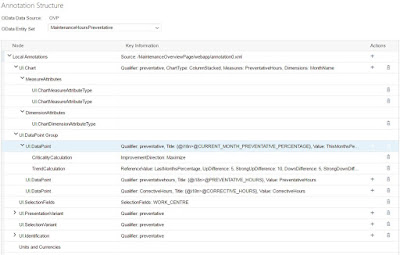
Now this is the most cryptic part of annotating, and rather than describe it to you; I’ll give you the final version of the annotations used in this example:
The full annotation file looks like this:
<edmx:Edmx xmlns:edmx="http://docs.oasis-open.org/odata/ns/edmx" Version="4.0">
<edmx:Reference Uri="/sap/bc/ui5_ui5/ui2/ushell/resources/sap/ushell/components/factsheet/vocabularies/UI.xml">
<edmx:Include Alias="UI" Namespace="com.sap.vocabularies.UI.v1"/>
</edmx:Reference>
<edmx:Reference Uri="/sap/bc/ui5_ui5/ui2/ushell/resources/sap/ushell/components/factsheet/vocabularies/Communication.xml">
<edmx:Include Alias="vCard" Namespace="com.sap.vocabularies.Communication.v1"/>
</edmx:Reference>
<edmx:Reference Uri="/sap/bc/ui5_ui5/ui2/ushell/resources/sap/ushell/components/factsheet/vocabularies/Common.xml">
<edmx:Include Alias="Common" Namespace="com.sap.vocabularies.Common.v1"/>
</edmx:Reference>
<edmx:Reference Uri="http://docs.oasis-open.org/odata/odata/v4.0/errata02/os/complete/vocabularies/Org.OData.Core.V1.xml">
<edmx:Include Alias="Core" Namespace="Org.OData.Core.V1"/>
</edmx:Reference>
<edmx:Reference Uri="http://docs.oasis-open.org/odata/odata/v4.0/cs01/vocabularies/Org.OData.Measures.V1.xml">
<edmx:Include Alias="CQP" Namespace="Org.OData.Measures.V1"/>
</edmx:Reference>
<edmx:Reference Uri="http://docs.oasis-open.org/odata/odata/v4.0/cs01/vocabularies/Org.OData.Capabilities.V1.xml">
<edmx:Include Alias="Capabilities" Namespace="Org.OData.Capabilities.V1"/>
</edmx:Reference>
<edmx:Reference Uri="http://docs.oasis-open.org/odata/odata-data-aggregation-ext/v4.0/cs02/vocabularies/Org.OData.Aggregation.V1.xml">
<edmx:Include Alias="Aggregation" Namespace="Org.OData.Aggregation.V1"/>
</edmx:Reference>
<edmx:DataServices>
<Schema xmlns="http://docs.oasis-open.org/odata/ns/edm">
<Annotations Target="ovp.xsodata.OVP.MaintenanceHoursPreventativeType">
<Annotation Term="UI.Chart" Qualifier="preventative">
<Record Type="UI.ChartDefinitionType">
<PropertyValue Property="ChartType" EnumMember="UI.ChartType/ColumnStacked"/>
<PropertyValue Property="Measures">
<Collection>
<PropertyPath>PreventativeHours</PropertyPath>
<PropertyPath>CorrectiveHours</PropertyPath>
</Collection>
</PropertyValue>
<PropertyValue Property="MeasureAttributes">
<Collection>
<Record Type="UI.ChartMeasureAttributeType">
<PropertyValue Property="Measure" PropertyPath="PreventativeHours"/>
<PropertyValue Property="Role" EnumMember="UI.ChartMeasureRoleType/Axis1"/>
<PropertyValue Property="DataPoint" AnnotationPath="@UI.DataPoint#preventativehours"/>
</Record>
<Record Type="UI.ChartMeasureAttributeType">
<PropertyValue Property="Measure" PropertyPath="CorrectiveHours"/>
<PropertyValue Property="Role" EnumMember="UI.ChartMeasureRoleType/Axis2"/>
<PropertyValue Property="DataPoint" AnnotationPath="@UI.DataPoint#CorrectiveHours"/>
</Record>
</Collection>
</PropertyValue>
<PropertyValue Property="Dimensions">
<Collection>
<PropertyPath>MonthName</PropertyPath>
</Collection>
</PropertyValue>
<PropertyValue Property="DimensionAttributes">
<Collection>
<Record Type="UI.ChartDimensionAttributeType">
<PropertyValue Property="Dimension" PropertyPath="MonthName"/>
<PropertyValue Property="Role" EnumMember="UI.ChartDimensionRoleType/Category"/>
</Record>
</Collection>
</PropertyValue>
<PropertyValue Property="Actions">
<Collection/>
</PropertyValue>
</Record>
</Annotation>
<Annotation Term="UI.DataPoint" Qualifier="preventative">
<Record Type="UI.DataPointType">
<PropertyValue Property="Title" String="{@i18n>@CURRENT_MONTH_PREVENTATIVE_PERCENTAGE}"/>
<PropertyValue Property="Value" Path="ThisMonthsPercentage"/>
<PropertyValue Property="CriticalityCalculation">
<Record Type="UI.CriticalityCalculationType">
<PropertyValue Property="ImprovementDirection" EnumMember="UI.ImprovementDirectionType/Maximize"/>
<PropertyValue Property="ToleranceRangeLowValue" String="50"/>
<PropertyValue Property="DeviationRangeLowValue" String="50"/>
</Record>
</PropertyValue>
<PropertyValue Property="TrendCalculation">
<Record Type="UI.TrendCalculationType">
<PropertyValue Property="ReferenceValue" Path="LastMonthsPercentage"/>
<PropertyValue Property="IsRelativeDifference" Bool="true"/>
<PropertyValue Property="UpDifference" Decimal="5"/>
<PropertyValue Property="StrongUpDifference" Decimal="10"/>
<PropertyValue Property="DownDifference" Decimal="5"/>
<PropertyValue Property="StrongDownDifference" Decimal="20"/>
</Record>
</PropertyValue>
</Record>
</Annotation>
<Annotation Term="UI.DataPoint" Qualifier="preventativehours">
<Record Type="UI.DataPointType">
<PropertyValue Property="Title" String="{@i18n>@PREVENTATIVE_HOURS}"/>
<PropertyValue Property="Value" Path="PreventativeHours"/>
</Record>
</Annotation>
<Annotation Term="UI.DataPoint" Qualifier="CorrectiveHours">
<Record Type="UI.DataPointType">
<PropertyValue Property="Title" String="{@i18n>@CORRECTIVE_HOURS}"/>
<PropertyValue Property="Value" Path="CorrectiveHours"/>
</Record>
</Annotation>
<Annotation Term="UI.SelectionFields">
<Collection>
<PropertyPath>WORK_CENTRE</PropertyPath>
</Collection>
</Annotation>
<Annotation Term="UI.PresentationVariant" Qualifier="preventative">
<Record Type="UI.PresentationVariantType">
<PropertyValue Property="SortOrder">
<Collection>
<Record Type="Common.SortOrderType">
<PropertyValue Property="Property" PropertyPath="MonthsBack"/>
<PropertyValue Property="Descending" Bool="true"/>
</Record>
</Collection>
</PropertyValue>
<PropertyValue Property="GroupBy">
<Collection/>
</PropertyValue>
<PropertyValue Property="TotalBy">
<Collection/>
</PropertyValue>
<PropertyValue Property="Total">
<Collection/>
</PropertyValue>
<PropertyValue Property="InitialExpansionLevel" Int="1"/>
<PropertyValue Property="Visualizations">
<Collection/>
</PropertyValue>
<PropertyValue Property="RequestAtLeast">
<Collection/>
</PropertyValue>
</Record>
</Annotation>
<Annotation Term="UI.SelectionVariant" Qualifier="preventative">
<Record Type="UI.SelectionVariantType">
<PropertyValue Property="Parameters">
<Collection/>
</PropertyValue>
<PropertyValue Property="SelectOptions">
<Collection/>
</PropertyValue>
</Record>
</Annotation>
<Annotation Term="UI.Identification" Qualifier="preventative">
<Collection>
<Record Type="UI.DataFieldForIntentBasedNavigation">
<PropertyValue Property="Determining" Bool="false"/>
<PropertyValue Property="SemanticObject" String="Action"/>
<PropertyValue Property="RequiresContext" Bool="true"/>
<PropertyValue Property="Action" String="toappnavsample"/>
</Record>
</Collection>
</Annotation>
</Annotations>
</Schema>
</edmx:DataServices>
</edmx:Edmx>
Wrap-Up and General Thoughts
Overview Pages should be (and to an extent are) easy to build/configure. Though with limitations and changing card characteristics between releases, it’s still a bit disjointed between design and build since designers really need to understand the possibilities with the various versions of the card. That said; providing insight to action; and once the link card is finally released; a place where a very generic “role” can come to work; this really will enhance people’s user experience compared to a Launchpad with Tiles alone. Personally, I hope more detailed real-world how-to guides (that go to much more detail than what I’ve skimmed over) are created. And for designers, more real-world and complete overview page examples are provided within build.me.





This is an interesting blog that you have posted, you shares a lot of useful things about Technology.
ReplyDeleteHtml5 Training in Chennai
Html5 Training in Velachery
Html5 Training in OMR
Best DOT NET Training institute in Chennai
asp.net training in chennai
DOT NET Training Institutes in Chennai
Best Html5 Training