I am going to focus on two exciting capabilities – the new R and the enhanced Python API for SAP HANA Machine Learning.
◈ The API’s are now generally available from April 5th with the release of HANA 2.0 SPS 04. You can download the packages multiple ways, for example with the HANA Express Download Manager and can get started straight away, for free!
◈ Alongside the Python API, we now have a comparable API for R! In my previous blogs, I have given a walk-through on how to use the Python API and the value it can bring for building Machine Learning models on massive datasets, but below you’ll find a preview of one of the enhanced features – Exploratory Data Analysis. With the addition of the R API, you can train and deploy models in a similar fashion. Below I have provided some code samples for the R API, but for a detailed overview see this blog by Kurt Holst.
◈ The manual stages of the Machine Learning process (such as feature engineering, data encoding, sampling, feature selection and cross validation) can now be taken care of by the Automated Predictive Library (APL) algorithms. The user only needs to focus on the business problem being solved.
Exploratory Data Analysis (EDA) is an essential tool for Data Science. It is the process of understanding your dataset using statistical techniques and visualizations. The insight that you gain from EDA can help you to uncover issues and errors, give guidance on important variables, draw assumptions from the dataset and build powerful predictive models. The Python API now includes 3 EDA techniques:
◈ Distribution plot
◈ Pie plot
◈ Correlation plot
Note: The EDA capabilities will be expanded with further release cycles.
The benefit of leveraging these EDA plots with the HANA DataFrame is best illustrated with some performance benchmarks. I tested these plots on the same 10 million row data set and compared the time it took to return to plots in Jupyter.
◈ Using a Pandas DataFrame = on average 3 hours
◈ Using the HANA DataFrame = less than 5 seconds, for each of the 3 plots
# Import DataFrame and EDA
from hana_ml import dataframe
from hana_ml.visualizers.eda import EDAVisualizer
# Connect to HANA
conn = dataframe.ConnectionContext('ADDRESS', 'PORT', 'USER', 'PASSWORD')
# Create the HANA Dataframe and point to the training table
data = conn.table("TABLE", schema="SCHEMA")
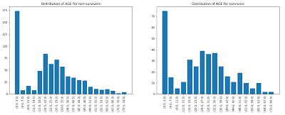
# Create side-by-side distribution plot for AGE of non-survivors and survivors
f = plt.figure(figsize=(18, 6))
ax1 = f.add_subplot(121)
eda = EDAVisualizer(ax1)
ax1, dist_data = eda.distribution_plot(data=data.filter("SURVIVED = 0"), column="AGE", bins=20, title="Distribution of AGE for non-survivors")
ax1 = f.add_subplot(122)
eda = EDAVisualizer(ax1)
ax1, dist_data = eda.distribution_plot(data=data.filter("SURVIVED = 1"), column="AGE", bins=20, title="Distribution of AGE for survivors")
plt.show()
Key Points
◈ The API’s are now generally available from April 5th with the release of HANA 2.0 SPS 04. You can download the packages multiple ways, for example with the HANA Express Download Manager and can get started straight away, for free!
◈ Alongside the Python API, we now have a comparable API for R! In my previous blogs, I have given a walk-through on how to use the Python API and the value it can bring for building Machine Learning models on massive datasets, but below you’ll find a preview of one of the enhanced features – Exploratory Data Analysis. With the addition of the R API, you can train and deploy models in a similar fashion. Below I have provided some code samples for the R API, but for a detailed overview see this blog by Kurt Holst.
◈ The manual stages of the Machine Learning process (such as feature engineering, data encoding, sampling, feature selection and cross validation) can now be taken care of by the Automated Predictive Library (APL) algorithms. The user only needs to focus on the business problem being solved.
Python Example – Exploratory Data Analysis
Exploratory Data Analysis (EDA) is an essential tool for Data Science. It is the process of understanding your dataset using statistical techniques and visualizations. The insight that you gain from EDA can help you to uncover issues and errors, give guidance on important variables, draw assumptions from the dataset and build powerful predictive models. The Python API now includes 3 EDA techniques:
◈ Distribution plot
◈ Pie plot
◈ Correlation plot
Note: The EDA capabilities will be expanded with further release cycles.
The benefit of leveraging these EDA plots with the HANA DataFrame is best illustrated with some performance benchmarks. I tested these plots on the same 10 million row data set and compared the time it took to return to plots in Jupyter.
◈ Using a Pandas DataFrame = on average 3 hours
◈ Using the HANA DataFrame = less than 5 seconds, for each of the 3 plots
# Import DataFrame and EDA
from hana_ml import dataframe
from hana_ml.visualizers.eda import EDAVisualizer
# Connect to HANA
conn = dataframe.ConnectionContext('ADDRESS', 'PORT', 'USER', 'PASSWORD')
# Create the HANA Dataframe and point to the training table
data = conn.table("TABLE", schema="SCHEMA")
# Create side-by-side distribution plot for AGE of non-survivors and survivors
f = plt.figure(figsize=(18, 6))
ax1 = f.add_subplot(121)
eda = EDAVisualizer(ax1)
ax1, dist_data = eda.distribution_plot(data=data.filter("SURVIVED = 0"), column="AGE", bins=20, title="Distribution of AGE for non-survivors")
ax1 = f.add_subplot(122)
eda = EDAVisualizer(ax1)
ax1, dist_data = eda.distribution_plot(data=data.filter("SURVIVED = 1"), column="AGE", bins=20, title="Distribution of AGE for survivors")
plt.show()

This is just a preview of the EDA capabilities, an in-depth overview of all the plots and parameters will be detailed in my next blog… stay tuned.
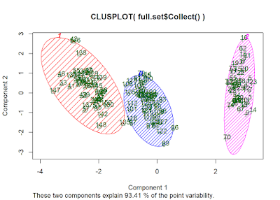
R Example – K Means Clustering
K-means clustering in SAP HANA is an unsupervised machine learning algorithm for data partitioning into a set of k clusters or groups. It classifies observation into groups such that object within the same group are similar as possible.
For this example, I will be using the Iris data set, from University of California, Irvine. This data set contains attributes of a plant iris. There are three species of Iris plants.
◆ Iris Setosa
◆ Iris Versicolor
◆ Iris Virginica
Connecting to HANA
# Load HANA ML package
library(hana.ml.r)
# Use ConnectionContext to connect to HANA
conn.context <- hanaml.ConnectionContext('ADDRESS','USER','PASSWORD')
# Load data
data <- conn.context$table("IRIS")
Data Exploration
# Look at the columns
as.character(data$columns)
>> [1] "ID" "SEPALLENGTHCM" "SEPALWIDTHCM" "PETALLENGTHCM"
[5] "PETALWIDTHCM" "SPECIES"
# Look at the data types
sapply(data$dtypes(), paste, collapse = ",")
>> [1] "ID,INTEGER,10" "SEPALLENGTHCM,DOUBLE,15"
[3] "SEPALWIDTHCM,DOUBLE,15" "PETALLENGTHCM,DOUBLE,15"
[5] "PETALWIDTHCM,DOUBLE,15" "SPECIES,VARCHAR,15"
# Number of rows
sprintf('Number of rows in Iris dataset: %s', data$nrows)
>> [1] "Number of rows in Iris dataset: 150"
Training K-Means Clustering model
library(sets)
library(cluster)
library(dplyr)
# Train K Means model with 3 clusters
km <- hanaml.Kmeans(conn.context, data, n.clusters = 3)
# Plot clusters
kplot <- clusplot(data$Collect(), km$labels$Collect()$CLUSTER_ID, color = TRUE, shade = TRUE, labels = 2, lines = 0)

# Print cluster numbers
Cluster_number<- select(km$labels$Collect(), 2) %>% distinct()
print(Cluster_number)
>> CLUSTER_ID
1 2
2 1
3 0
These snippets are not meant to be an exhaustive analysis, simply to showcase some of the capabilities within the API.
No comments:
Post a Comment