Source: https://www.history.com/topics/exploration
There have been many great explorers of the world. Each uncovering new land, people, treasures and so on. Exploration is an innate fascination of us humans, we like to discover the unknown.
With the release of the HANA ML Python package (1.0.7), you can curb the appetite for exploration with the optimised functionality for “Exploratory Data Analysis” (EDA).
Exploratory Data Analysis
EDA is the process of analysing the statistical properties of a data set using various methods, techniques and visualisations to gain a greater understanding of the data that you’re working with.
Why is this important? EDA is an essential step within the Data Science and Machine Learning pipeline. Without fully understanding the statistical properties of a data set, this can cause serious errors and unrepresentative results when applying Machine Learning algorithms. EDA is not only great for understanding your data, it also gives guidance as to how you should treat and prepare your data to get the best results from it. A comprehensive EDA can hugely benefit the results of a Machine Learning model, hence it is an essential tool within the Data Scientist’s toolkit.
Challenges of EDA
The main challenge surrounding EDA, especially when working with large data sets, is productivity. Waiting several hours for graphs to render is a huge setback, but unfortunately in the open source world… there is not always a suitable way round this. If I was to create a scatter plot using open source packages such as Pandas and MatplotLib, the entire data set would be physically moved to the Python client for processing and plotting on the axes. If I am working with millions of data points, this can take hours.
HANA ML EDA
So how does the HANA ML EDA capabilities alleviate these challenges? Let’s review the HANA DataFrame once again.
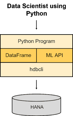
An SAP HANA DataFrame provides a way to view the data stored in SAP HANA without containing any of the physical data. An SAP HANA DataFrame hides the underlying SQL statement, providing users with a Python interface to SAP HANA data. By reducing data transfer and leveraging the processing power of the HANA database, the EDA capabilities are optimised to crunch billions of rows of data and only return the necessary statistics for the graphs to be plotted.
As a test, I produced 3 plots (distribution, bar & pie) using the open source combination of Pandas and MatplotLib on a 10 million row data set. Each of these plots took approximately 3 hours to render.
When running the same plots using the HANA ML package, each took less than 5 seconds to render…
These tests were not intended to be official bench-marking statistics, simply some development tests that I performed myself. Nevertheless, the productivity gains and ability to analyse entire data sets, not just samples, is a big win for Data Scientists.
How does it do it?
By utilizing the processing power of HANA, the HANA ML package intelligently creates SQL statements on the fly to return only the essential statistics to the Python client necessary for plotting each graph. This massively reduces rendering times and minimizes the data transfer between HANA and Python.
Now I’ll showcase each of the capabilities in action. I will give a short explanation for each plot, but for a more detailed understanding please research each plot separately. This tutorial is only intended to show you how to create these for yourself. I’ll be using the Titanic data set which contains the following 12 columns:
◈ Age – The Age of the passenger in years.
◈ Cabin – The Cabin number that the passenger was assigned to. If NaN, this means they had no cabin and perhaps were not assigned one due to the cost of their ticket.
◈ Embarked – Port of embarkation (S = Southampton, C = Cherbourg, Q = Queenstown).
◈ Fare – The fare of the ticket purchased by the passenger.
◈ Name – Full name and title of the passenger.
◈ Parch – Number of parents and children associated with the passenger aboard.
◈ PassengerId – Unique ID assigned to each passenger.
◈ Pclass – Class of ticket purchased (1 = 1st class, 2 = 2nd class, 3 = 3rd class).
◈ Gender – Gender of the passenger.
◈ SibSp – Number of siblings and spouses associated with the passenger aboard.
◈ Ticket – Ticket number.
◈ Survived – Survival flag of passengers
Credit for the dataset goes to: https://www.kaggle.com/c/titanic/data, where you can find more information.
Distribution Plot
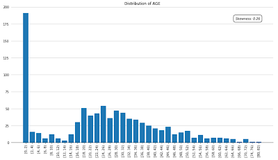
Distribution plot showing the distribution of Age within passengers of the Titanic.
# Import EDA class
from hana_ml.visualizers.eda import EDAVisualizer
f = plt.figure(figsize=(15,8))
ax1 = f.add_subplot(111)
eda = EDAVisualizer(ax1)
ax, dist_data = eda.distribution_plot(data=data, column="AGE", bins=50, title="Distribution of AGE", debrief=True)
plt.show()
The distribution plot shows the distribution of values for a numeric column. This plot gives a quick indication as to how ‘skewed’ a variable is in comparison to a normal distribution. This is important to know because many Machine Learning models are based on the assumption that each variable is ‘normally’ distributed. Leaving variables with ‘skewness’ within a model can affect the reliability of its predictions.
Note: You may notice that when plotting the chart, it returned a tuple of variables, in this case ‘ax’ and ‘dist_data’.
◈ ‘ax’ is this axes that the chart has been plotted on.
◈ ‘dist_data’ is the essential data set returned to the client that is used for plotting.
You will see that for each plot, a tuple is always returned. Feel free to explore the returned data and you will find that it’s size is greatly reduced from the raw table! Here is a preview of the data returned for the distribution plot above.
Pie Plot
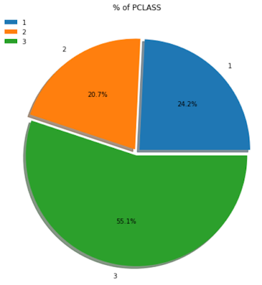
Pie plot showing the distribution of Ticket Class within passengers of the Titanic.
f = plt.figure(figsize=(15,8))
ax1 = f.add_subplot(111)
eda = EDAVisualizer(ax1)
ax, pie_data = eda.pie_plot(data=data, column="PCLASS", explode=0.03, title="% of PCLASS", legend=True)
plt.show()
The pie plot is a great way to understand the distribution of categorical or discrete numeric columns. It shows you the % of rows for each unique value of a column.
Correlation Plot
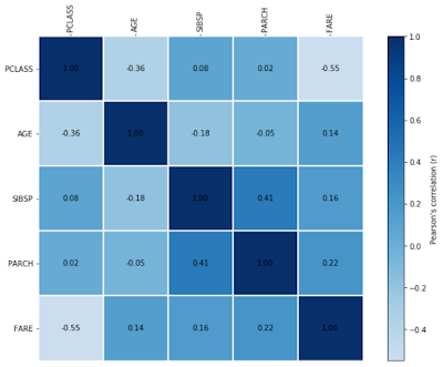
Correlation plot showing the linear relationship between 5 numeric columns within the Titanic data set.
f = plt.figure(figsize=(12,8))
ax1 = f.add_subplot(111)
eda = EDAVisualizer(ax1)
ax, corr_data = eda.correlation_plot(data=data, corr_cols = ["PCLASS", "AGE", "SIBSP", "PARCH", "FARE"],
label=True, cmap="Blues")
plt.show()
The correlation plot is a very useful tool in understanding the linear relationship between numeric columns in a data set. It uses Pearson’s correlation coefficient to generate a value between -1 and +1, -1 indicating a strong negative correlation and +1 indicating a strong positive correlation. This plot is essential for Data Scientists because identifying and eliminating linear relationships is an important task before training a Machine Learning model. This is because many algorithms assume that all predictor variables are independent, but if two variables exhibit a strong correlation, then this suggests that one depends on another, or that they share similar information. The task of removing these dependencies is called resolving multicollinearity, and the correlation plot is an good way to tackle this.
Scatter Plot
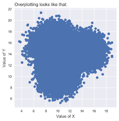
The scatter plot shows the relationship between two numeric columns. However, when working with large data sets scatter plots tend to ‘overplot’, as shown below:
Source: https://python-graph-gallery.com/134-how-to-avoid-overplotting-with-python/
By this, we mean that due to having so many points to plot, eventually they start to overlap and it becomes impossible to identify the areas of density.
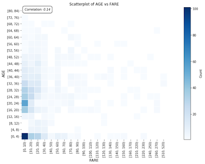
Now let’s take a look at a HANA ML EDA scatter plot, showing the relationship between Age and Fare within passengers of the Titanic.
f = plt.figure(figsize=(20,8))
ax1 = f.add_subplot(111)
eda = EDAVisualizer(ax1)
ax, scat_data = eda.scatter_plot(data=data, x='FARE', y='AGE', x_bins=50, y_bins=20, title="Scatterplot of AGE vs FARE",
debrief=True)
plt.show()
We have taken a different approach to avoid the issue of overplotting. Instead of plotting each individual point, we plot using bins and the colour of each bin represents the density of data points present in that bin.
Bar Plot
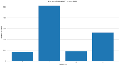
Bar plot showing the maximum Fare paid by passengers boarding from each location.
f = plt.figure(figsize=(15,8))
ax1 = f.add_subplot(111)
eda = EDAVisualizer(ax1)
ax, bar_data = eda.bar_plot(data=data, column='EMBARKED', aggregation={'FARE': 'max'}, title="Bar plot of EMBARKED vs max FARE")
plt.show()
One of the most simple but effective plots is the bar plot. This plot allows you to aggregate values of a categorical or discrete numeric column. You can use it to see the counts of rows for each value of a category, or aggregate against a numeric column using minimum, maximum or mean.
Box Plot
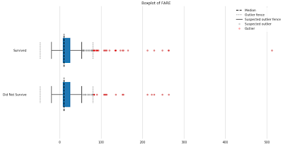
Box plot showing Fare of passengers that survived against passengers that didn’t survive.
f = plt.figure(figsize=(15,8))
ax1 = f.add_subplot(111)
eda = EDAVisualizer(ax1)
ax, box_data = eda.box_plot(data=data, column='FARE', outliers=True, title="Boxplot of FARE", groupby="SURVIVED")
plt.show()
The box plot is a very informative plot, showing us lots of statistical information. It shows us the median, lower quartile, upper quartile, inter-quartile range, minimum, maximum, suspected outliers and true outliers. Outliers are an interesting topic for a Data Scientist. Using a box plot will help to guide the user in understanding whether these ‘outliers’ are truly outliers… or just large values. Eliminating outliers is an important task to complete before training a Machine Learning model because when using certain algorithms, larger values are given a greater weighting and so outliers can skew the results of a predictive model.
These 6 plots make up the core EDA capabilities available out of the box with the latest HANA ML package. However, there is one extra capability that can help to accelerate the exploration phase for a Data Scientist.
Profiler
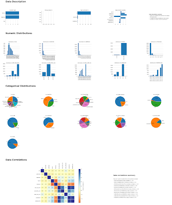
The Profiler automatically builds a profile of your data set. It includes:
◈ A data description
◈ Missing values
◈ Warnings for high cardinality and high skewness
◈ Numeric distributions
◈ Categorical distributions
◈ Linear correlations
◈ Warnings for multicollinearity
◈ As well as qualitative interpretations of results
It’s especially useful when first exploring a data set to understand data types, distributions and areas of interest such as high correlations or highly skewed variables. The analysis provided by the Profiler is analysis that a Data Scientist would have to complete manually before training a Machine Learning model. Therefore, the Profiler is a great way to automate a Data Scientist’s workflow.
Below is an example of how to use this capability, once again working with the Titanic data set.
# Import Profiler class
from hana_ml.visualizers.eda import Profiler
# Create analysis
p = Profiler()
fig = p.description(data=data, key="PASSENGER_ID", missing_threshold=5, card_threshold=100)
# Render plot
fig
Once the analysis is complete, you can view the Profiler by simply running the ‘fig’ variable returned in the previous snippet.


No comments:
Post a Comment